Evaluating LinkedIn
8 Times LinkedIn Violated Interaction Design Principles.

- TL;DR - I did this assignment for Eric Paulos’s User Interface Design class (CS 160, UC Berkeley). TThe assignment was to choose an application and conduct a heuristic evaluation where I find examples of violations of Neilson’s principles for interaction design. I chose LinkedIn for Android, an app I use quite frequently. Below are some examples of its violations. I explained each violation of the heuristics, and gave them severity scores. Disclaimers: I did this assignment in September 2018, so the current version of the app may have developed (and gotten rid of these violations) since then.
Introduction
Since I started looking for a job, I’ve been spending a lot (A LOT) of time on LinkedIn. I check notifications, read messages, add connections, and save potential jobs from their Android application; I usually do the browsing and applying from their web app. While LinkedIn’s Android app is handy for job searching and networking, it has various violations of Neilson’s principles for interaction design on the smartphone interface. Below, I outline some of the aspects of the LinkedIn application that make user experience difficult and inconvenient on Android devices.
The Evaluation
Two different “Search” bars showing slightly different things
The first home screen/news feed tab displays a Search bar at the top of the page (first picture below). This Search bar features the ability to find People, Jobs, and Content (second picture below). Upon clicking Jobs, it allows the user to implement filters, or simply input keywords/locations. The screen shows recommended jobs before even inputting keywords, locations of filters (third picture below).
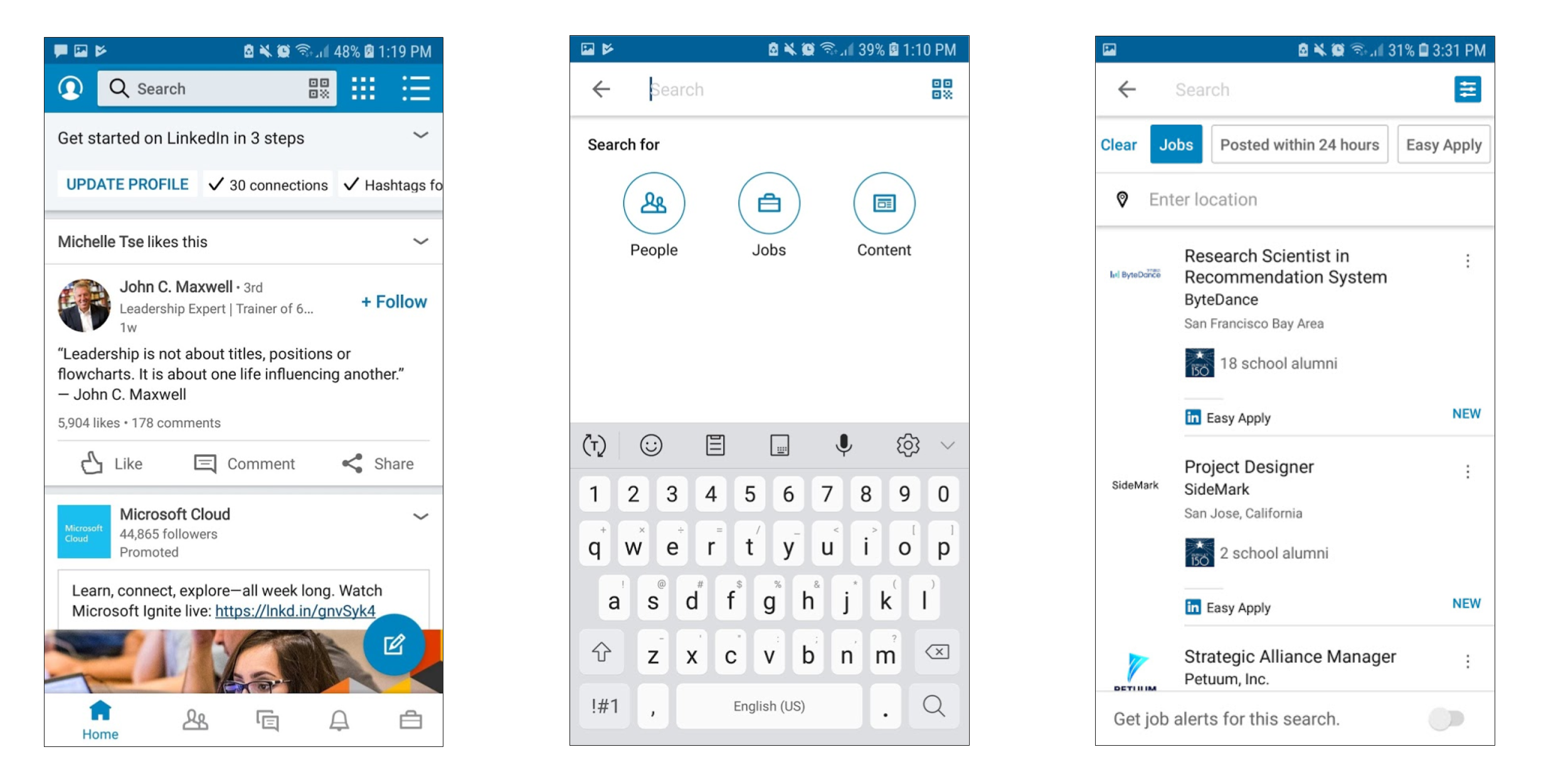
Meanwhile, the last tab on the navigation bar also contains job recommendations, as well as a Search bar (first picture below). This search bar is different as it is specifically for jobs, and does not allow you to search for People or Content. Upon clicking the Search bar, we cannot place filters like we can from the Search bar on the home screen/news feed. Additionally, the job recommendations on this tab differ from the job recommendations in the Search bar from the home screen/news feed tab, implying a different algorithm is being used for the same purpose/feature. This Search bar also asks for keywords as well as location but using different vocabulary (second picture below), leaving the user confused whether these two Search bars have the same purpose or not.
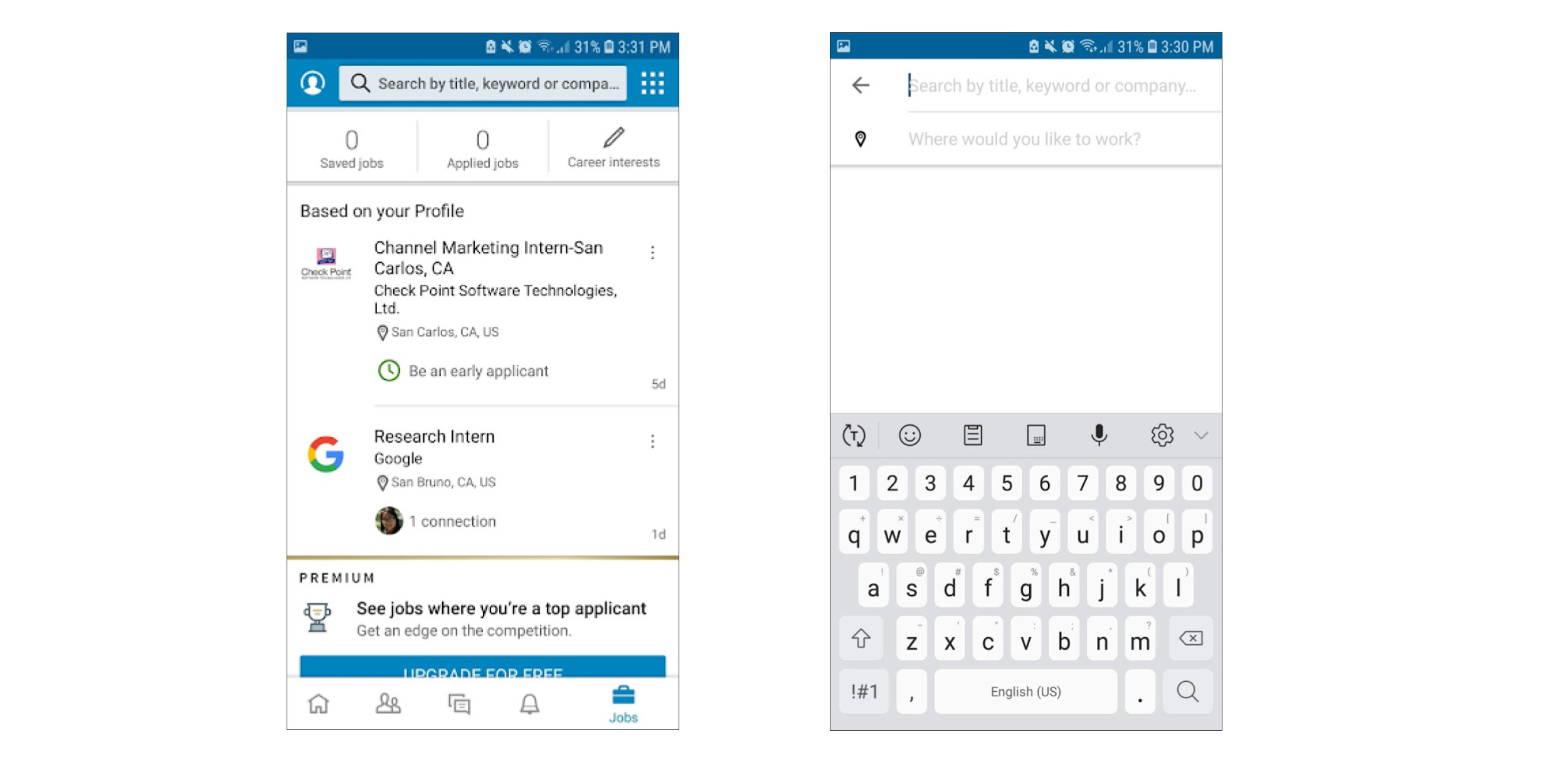
The existence of these two Search Jobs features fulfilling similar yet slightly different purposes (filter vs. no filter, differing recommendations) violate the “Consistency and Standards” heuristics. The app should, instead, implement only one Search Jobs feature and allow one search on one tab to link to the other search on the other tab. This would promote consistency of usage as well as results, and follow platform conventions.
Considering that LinkedIn is an application used mainly for job searching, this usability problem is severe (severity rating: 3, major usability problem). The user would frequently encounter it, and it is a persistent problem. Although, objectively, the user could just choose whichever Search method he likes better and use it consistently, one must (again) reconsider that the function of this application is to search for jobs. Therefore, the market impact of this usability problem (inconsistent searches for the same purpose) is high and must be addressed immediately.
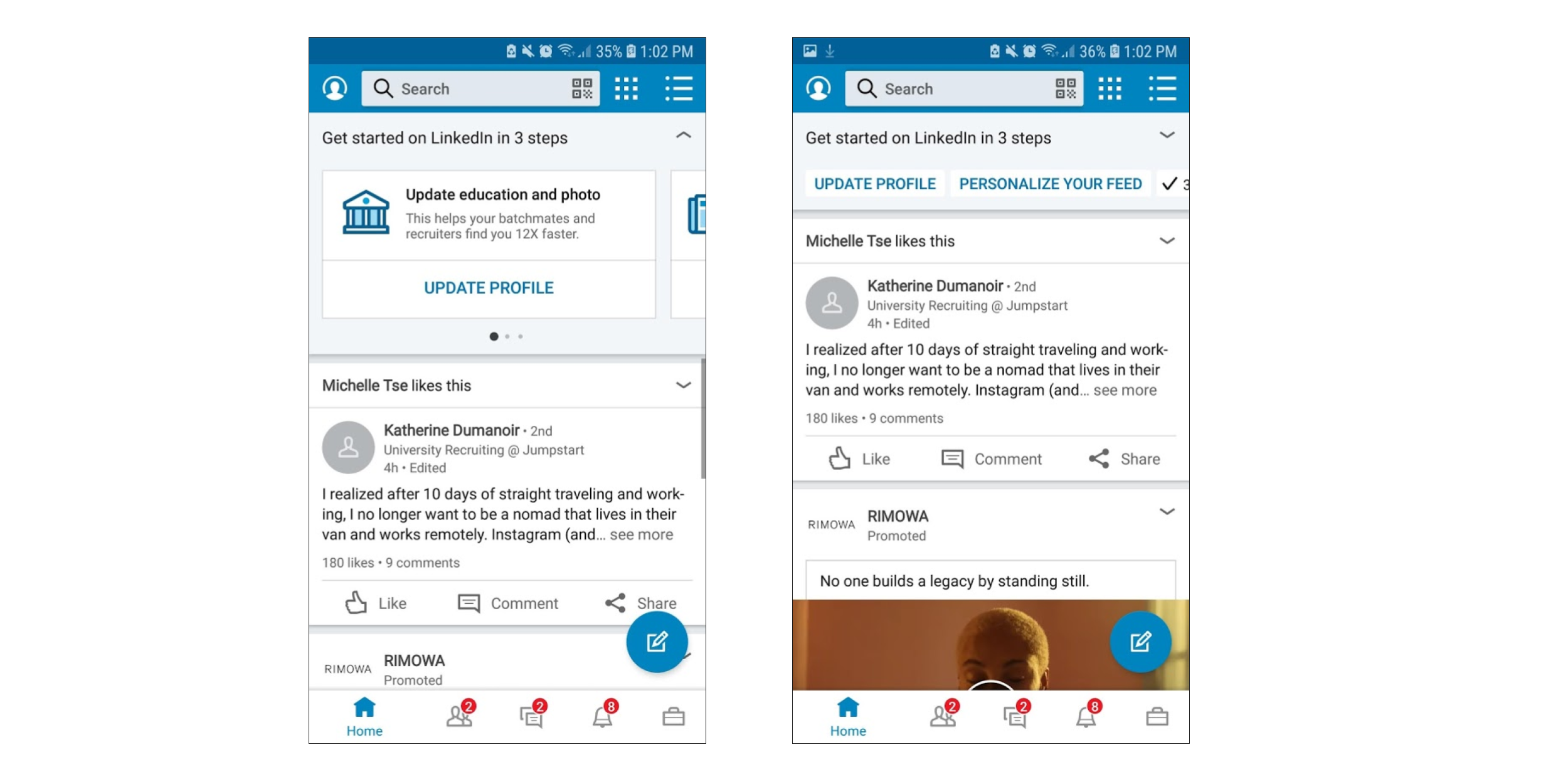
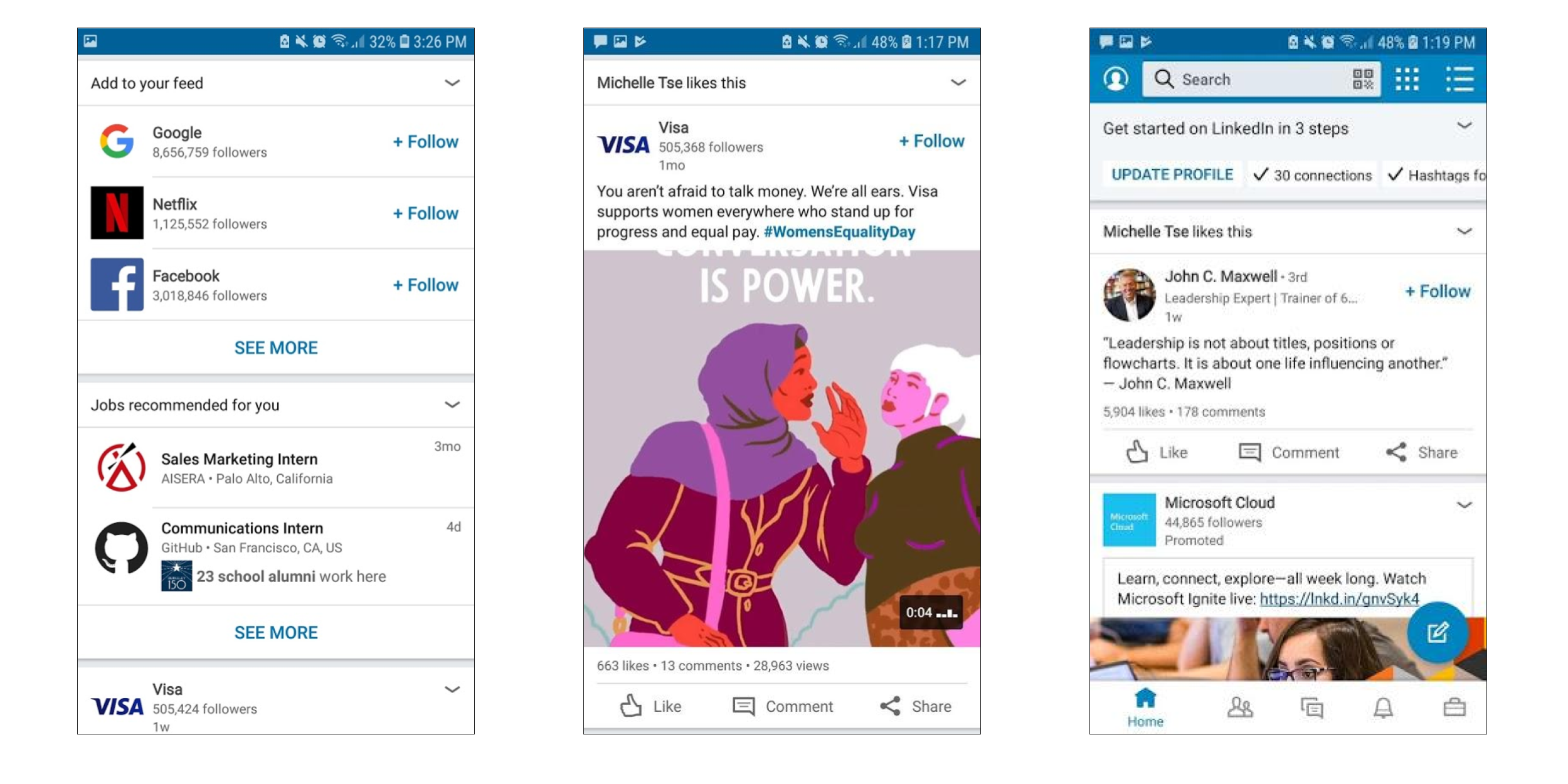
Too many different kinds of information available on news feed
The first home screen/news feed tab displays numerous different kinds of information, from friends’ statuses and pictures, to their likes of other friends’ posts, to companies’ posts, to ads, to job recommendations, to follow recommendations, and so on.
Below are several screenshots of posts from my news feed. Notice the different kinds of posts: Job update of a connection, posts/shares of non-connections that are liked by a connection, an advertisement, posts by organizations I do not follow, job recommendations, a connection’s work anniversary (and prompts to congratulate her), post by an organization I follow (Cal), and finally, a post regarding a topic that is trending in my location.
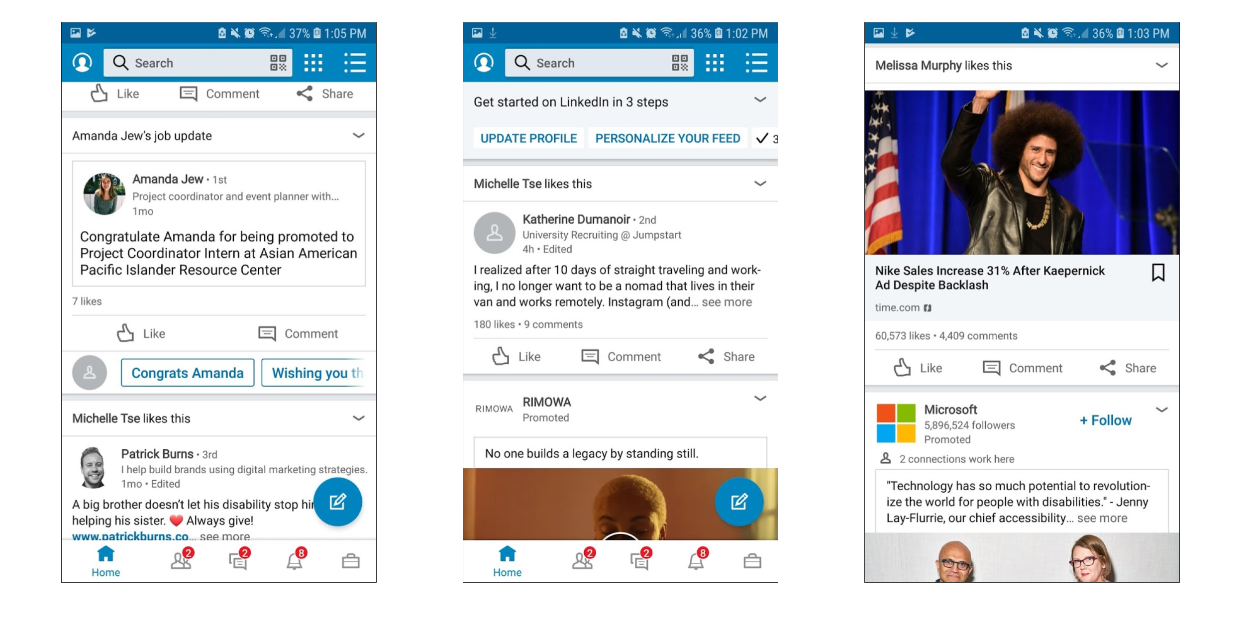
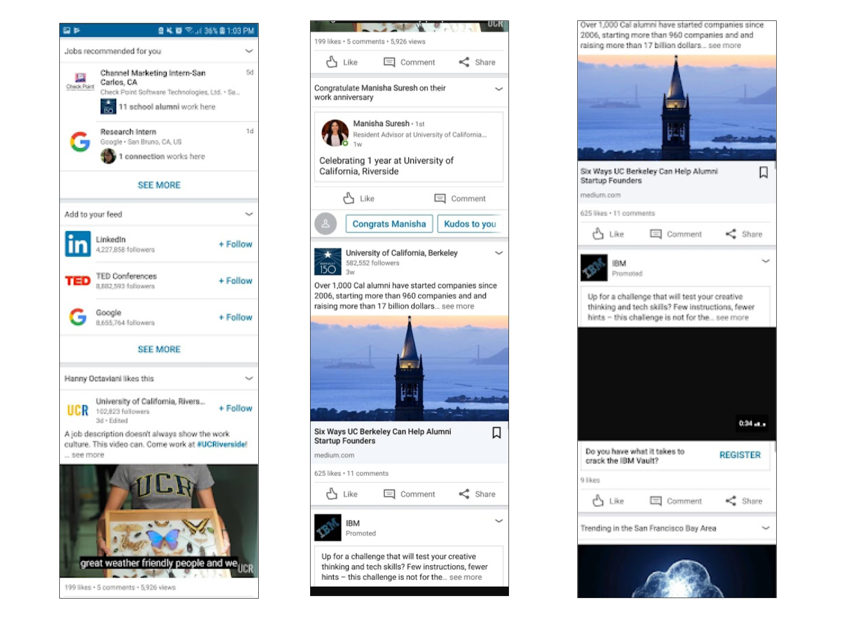
This usability problem violates the heuristic “Aesthetic and Minimalist Design”. It is simply overwhelming for the user to receive so many different kinds of information on just one tab. Information about companies I do not follow, people I am not connected with is unnecessary, or job recommendations is not necessary on the main screen/news feed tab when there are other tabs devoted to specifically these functions.
The severity of this usability problem is also high as users come into contact with it very frequently and persistently. It also has a huge impact on user experience and should be fixed immediately (severity rating: 3, major usability problem).
No Instructions for Discovering Communities
For a new user, joining a community is difficult. The user is prompted with no information regarding what a community is, and is given a vague pencil icon, and a “Discover More” button (first picture below). A user may think the pencil icon is to add or “write/type” new communities (which we later find out are hashtags), but in reality, this pencil icon is to manage pre-existing communities that a new user does not yet have. However, this only leads to a completely blank screen with no information for new users (second picture below). The user must reverse steps and press “Discover More” (which initially sounded more like an “Extras” button and less like the main functionality of the feature). On this screen, the user is presented with pre-determined hashtags, and is unable to search for a “community” he is actually interested in (third picture below).
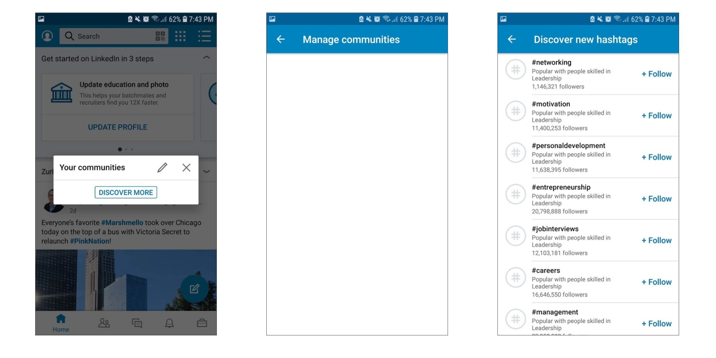
For a new user, the process of choosing communities is extremely confusing. This usability problem violates the “Help and Documentation” heuristic. Therefore, instead of presenting a blank screen under “Manage communities”, the app should provide a Help dialogue. This should include examples of communities (hashtags), how to find them (select, not search), etc.
Since LinkedIn is modeled as a Social Network, it seems important for users to know how to join communities (similar to joining “Groups” on Facebook); therefore, this usability problem has a rather high impact.
However, since this problem only applies to new users, its frequency and persistence is very low. The market impact is low as, once again, this problem only applies to novel users and a solution can be figured out with some use. In conclusion, the severity of this usability problem is not major (severity rating: 2, minor usability problem).
Disappearing Navigation Bar
The navigation bar displays the tabs that are necessary to maneuver through the different features of the application. However, when scrolling down through any tab, the navigation bar disappears (second picture below). In this case, the user must scroll up to see the navigation bar again. When visiting a user’s profile, the navigation bar also disappears (third picture below). The user must press the back arrow in the upper left corner to see the navigation bar. Occasionally, the navigation bar does not appear at all until the user has returned all the way back to the beginning of the tab (scroll all the way up).
Notice in the screenshots above that the navigation bar/tabs menu is present in the bottom of the screen in the first screenshot, but upon scrolling down (in the second screenshot), it disappears. This makes it difficult for the user to remember exactly where they are in the app. Therefore, this usability problem violates the heuristic of “User Control and Freedom”. This heuristic encourages the application to allow the user to easily navigate from whatever screen or position, or even have an “emergency exit” to leave the state they are currently in without extensive action (pressing back multiple times or scrolling all the way up).
This usability problem is frequent as well as persistent. Its impact for both individual as well as market, however, is not so huge. Since this usability problem can be solved with just some “getting used to”, the severity of this problem is not major (severity rating: 2, minor usability problem).
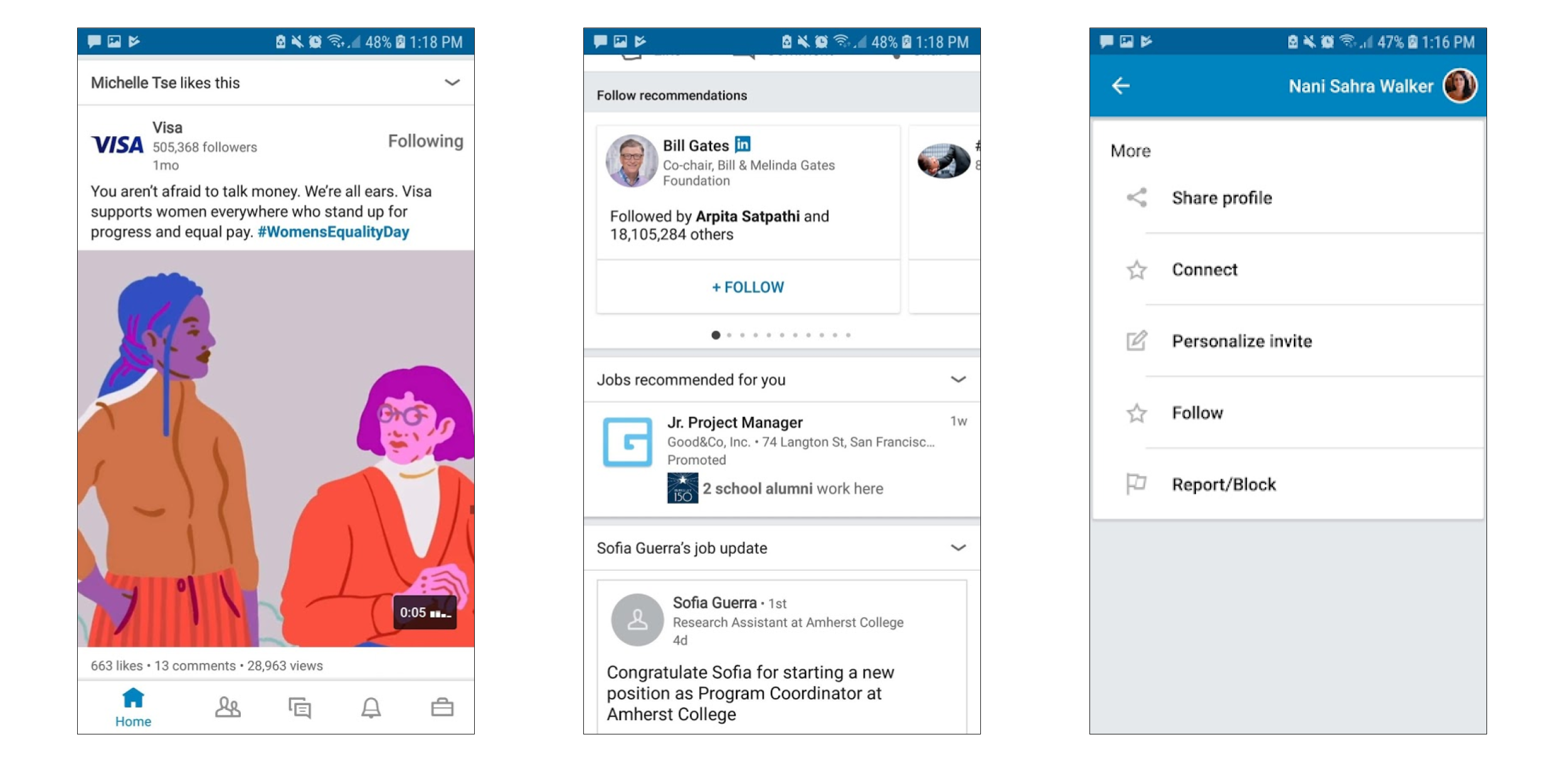
Inability to Dismiss Profile Suggestions
When on my main screen/news feed app, the LinkedIn application offers suggestions on how to improve my profile (e.g. “Update education and photo; first picture below). Although I have had this application for years, the application still treats me like a new user. In effect, it does not allow me to remove the profile suggestions. Although I can minimize these suggestions (second picture below), they still appear on my main screen/news feed tab. I have refused to update these suggestions several times, but the only way to get rid of these suggestions is to follow them.
This feature may be frustrating for those who refuse to comply with the suggestions. Being treated like a new user, when in reality, we have been using this app for years but simply do not wish to upload a photo can be a frustrating experience. This usability problem violates the heuristic of “Flexibility and Efficiency of Use”. Users who have previously been suggested to update their profile, but refused to, should be able to do more than just minimize the suggestion: they should be able to delete the suggestion from their main screen/news feed altogether. Although inexperienced users may find these suggestions helpful, experienced users should be able to choose what information they want to update, and what profile suggestions they want to dismiss permanently.
This usability problem has a high frequency as the suggestions are displayed every time the user opens the application or returns to the news feed tab on the navigation bar. It is persistent as there is no way to dismiss the suggestions, only a way to minimize them. However, the impact is not high as the user can simply learn to ignore the suggestions, and navigate to a different location on the app to no longer see the suggestions (scroll down, or change the tab). As a result, the market impact is also not huge. Therefore, the severity of this usability problem is not major (severity rating: 2, minor usability problem).
The Various Ways to Connect (or Follow)
Making a connection on LinkedIn is not consistent. Some users have a “Connect” button right on their profile (first picture below), while other users only have a “Message” button and require another step (arrow button) to be able to connect with them (third picture below). This additional step does not seem like a security preference by the user as we are still able to send them a connection request; the only difference is one extra step.
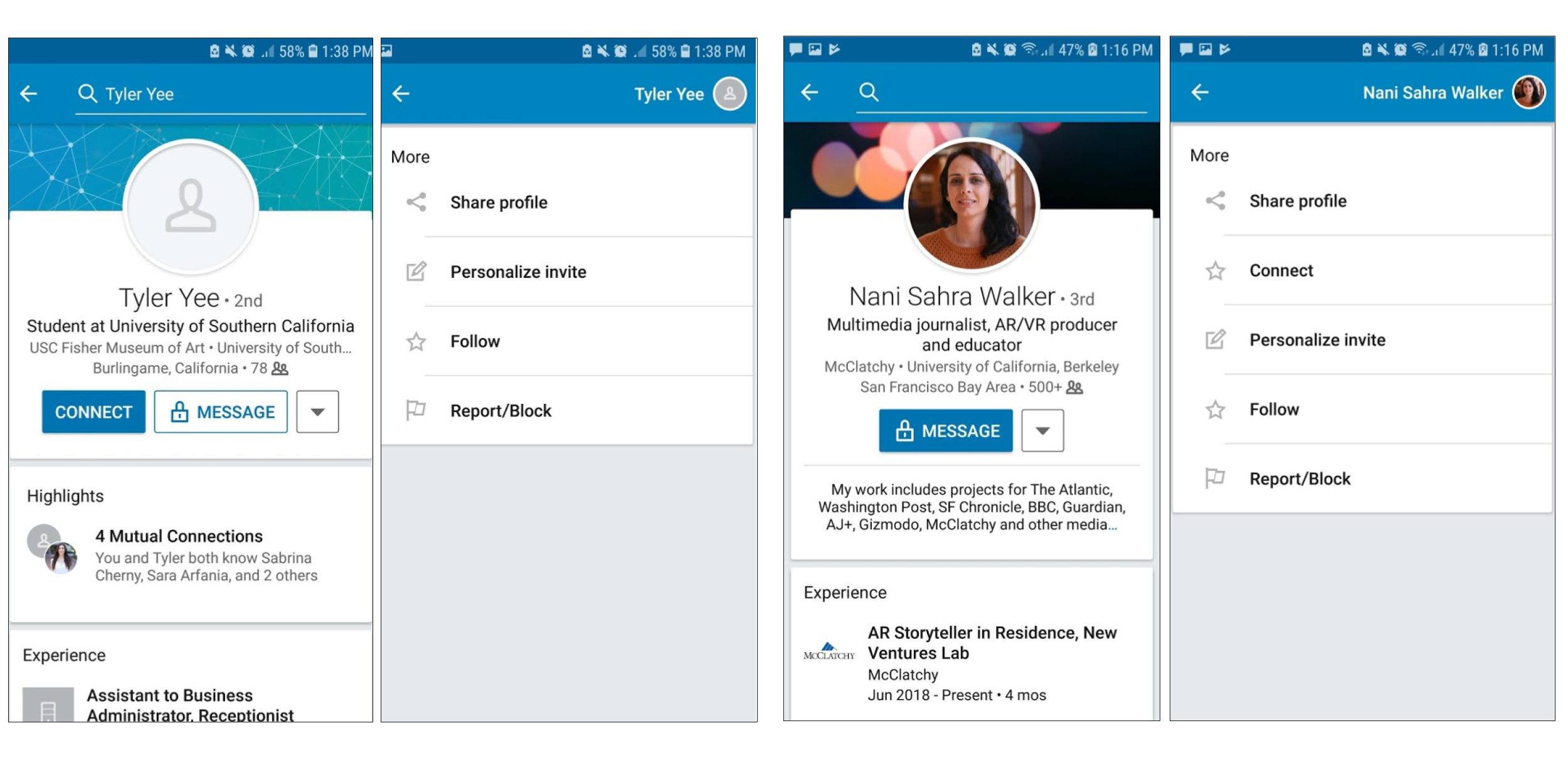
Both of these users were found from my recommended connections list. While Tyler has an easy Connect button on his profile, I must first click the arrow on Nani’s profile to, then, press Connect in the options. Another inconsistency to note is that “Follow” is marked with a star logo for users, just as “Connect” is also marked with a star logo for users (second and fourth pictures above). However, “Follow” is marked with a plus logo for organizations (all three pictures below). This is inconvenient because the “Follow” function is similar for both users as well as organizations and therefore should have a single, consistent logo; whereas the “Connect” feature is different from “Follow” and therefore should have two different logos.
This issue violates the heuristic of “Consistency and Standards”. The different ways to Connect to users may make it seem like the connections being made differ in some way. The same logo for “Connect” and “Follow” for users make it seem as if their functions are the same; when in reality, the “Follow” with a star and “Follow” with a plus sign have the same function and “Connect” with a star has a different function from both “Follow”s.
This usability problem is frequent and persistent, as the purpose of the LinkedIn app is to make connections. However, this problem again can be solved with some “getting used to” and understanding that organizations are different from users. Therefore both the individual impact as well as the market impact are not so large for this usability problem. The severity of this problem is not major (severity rating: 2, minor usability problem).
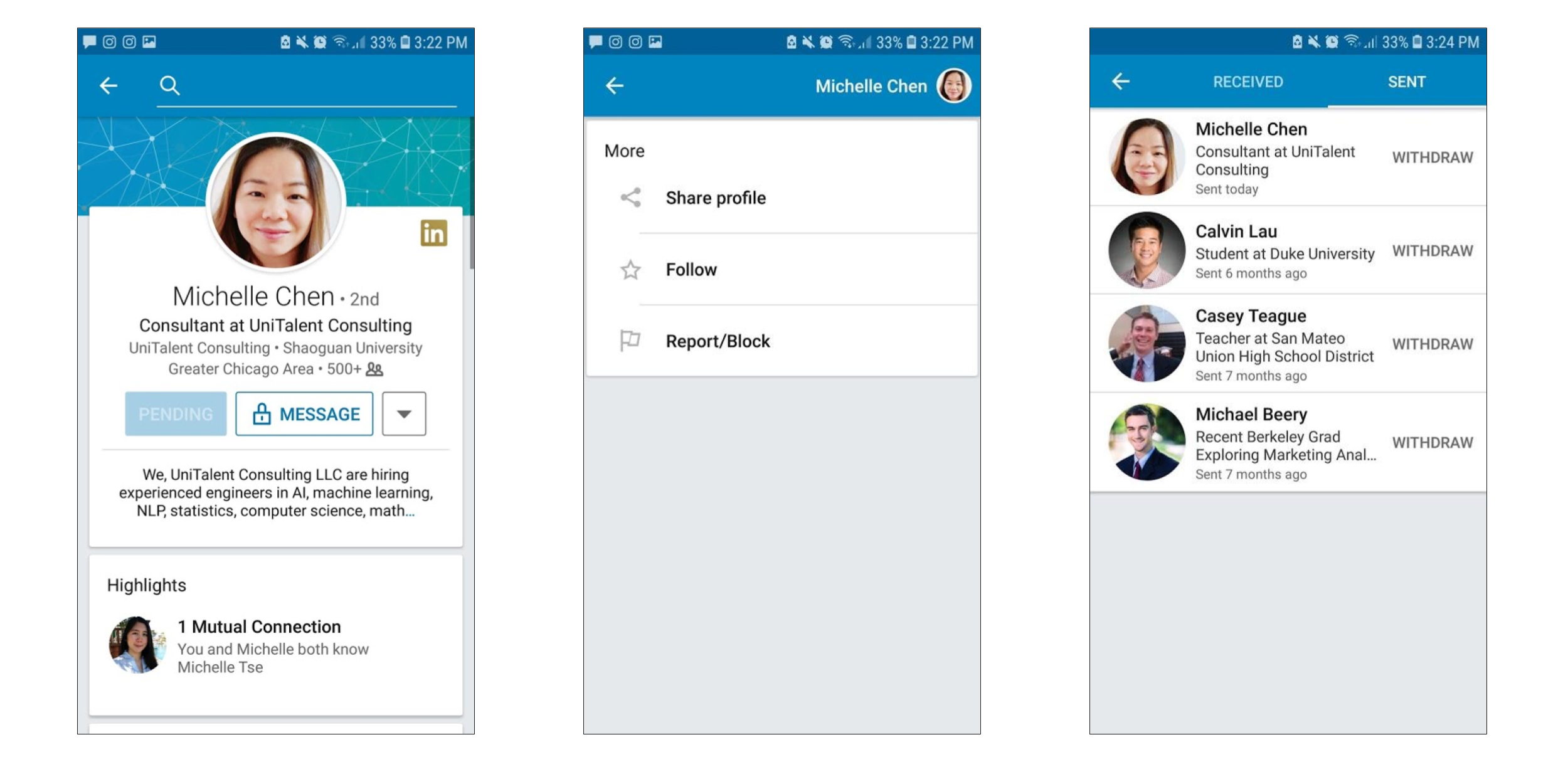
Unclear Steps for Withdrawing a Connection Request
When a user sends a connection request to a profile, the user sees the “Connect” button change to an unclickable “Pending” logo (first picture below). From clicking the arrow with extra options, the user is unable to withdraw the connection request (second picture below). The only way to withdraw this request is to reverse to a screen where the navigation bar is present, click the “Connections” (second) tab, click “Manage”, click “Sent”, and then click “Withdraw” next to the profile’s name (third picture below). This process is inconvenient compared to Facebook’s “cancel request” or Twitter’s “unfollow” feature (where they can simply click the “pending” status to undo).
This issue violates the “Error Prevention” heuristic or the “User Control and Freedom” heuristic. The user should be able to “undo” the connection request. A dialog should be implemented in order to easily unsend the connection request from the profile (immediately or on a later visit), instead of carrying out a series of steps in a different navigation bar tab (Connections). This would easen the process of accidental requests sent (error prevention), or a user’s change of mind (user control and freedom).
Since users may not usually change their mind regarding a connection, or accidentally send a connection request, this problem is neither frequent nor persistent. The impact, both for the individual user as well as the market, is not so large as most users think twice or are careful before sending a connection request; and there is a (less obvious but available) process for withdrawing the request. Therefore, this usability problem is not severe or a priority (severity rating: 1, cosmetic problem only).
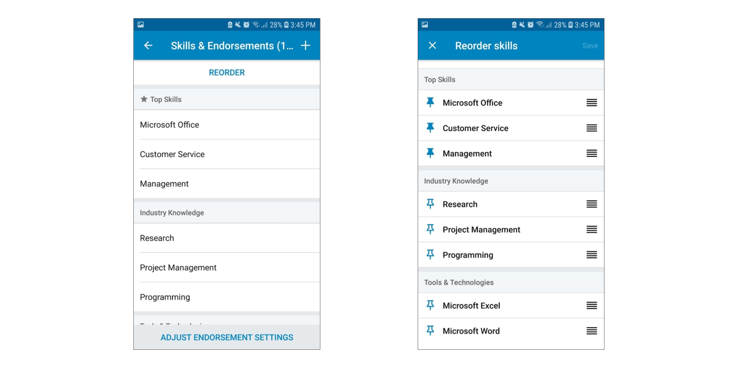
Unclear Steps for Removing a Skill
When updating one’s profile, it is difficult to remove “Skills”. A “Reorder” button is provided (first picture below), which suggests that this button will only allow the user to change a skill from “top skill” to “industry knowledge” or to a different category, or vice versa (second picture below). This button is improperly named; it should be named “Edit” as it also allows the user to delete the skill. In the Reorder skills screen, one can press the pin icon to pin (or unpin) a skill from Top Skills. One can press the four-horizontal-lines icon to drag the skill from one section to another (e.g. from “Tools and Technologies” to “Industry Knowledge”). However, I was stuck on the Skills screens for about 10 minutes because I could not find a way to delete a skill. There is little indication that from the “Reorder skills” screen, one can swipe either right or left to permanently delete a skill from the list. Although reordering seems simple, deleting is difficult to find.
This issue violates the “Error Prevention” heuristic or the “User Control and Freedom” heuristic. The user should be able to easily find a way to “undo” (delete) the skills on the list. This would easen the process of accidental skills added (error prevention), or a user’s change of mind (user control and freedom).
Since users may not usually change their mind regarding a skill, or accidentally add a skill to their lists, this problem is neither frequent nor persistent. The impact, both for the individual user as well as the market, is not so large as most users are sure they possess a skill before adding it to their lists; and there is a (less obvious but available) process for deleting the skill. Therefore, this usability problem is not severe or a priority (severity rating: 1, cosmetic problem only).
Conclusion
Despite these interaction design flaws, LinkedIn still remains my most-used app! Changing the above-mentioned design interactions will help increase ease and efficiency of use of the application.