RoadMap
A Work Management Tool for NGOs
- TL;DR - I worked as a User Experience Designer for a team of grad students in the UC Berkeley School of Information. My task was to design a work management tool, similar to Asana, but specifically for NGOs and smaller start-ups. The project was fast-paced to emulate real-world design tasks.
Project Details
Project RoadMap is part of the UC Berkeley, School of Information, final Master of Information Management and Systems projects. The purpose of their project is to create a platform that allows companies and NGOs to propose technical and design projects to be distributed amongst and completed by students.
Part of the project proposal is to create SMART (specific measurable achievable relevant time-bound) goals, so that both NGOs and students can have aligned project deliverables. Therefore, to meet this part of the proposal, I was given strict deadlines that and specific time constraints to come up with a product. The team provided me with some user research from interviews conducted with NGOs, from which I had to analyze user needs and core functionalities of a desired product. I was also provided with feedback from a Senior Designer halfway through the project.
The Problem
Smaller start-ups and NGOs require organizational and management tools for various kinds of tasks done by different types of employees. While products such as Asana and Trello are very useful and thriving, they don't address some concerns that may be cause for inconvenience in how an NGO operates.
For this project, my task was to create an Asana-like product that would meet specific needs of NGOs. While Asana is great, it is not free for larger teams. It also does not handle the concept of part-time employees, short-term employees, or volunteers, which are some core features of an NGO.
Product Overview
The purpose of this project is to create a platform of collaboration and teamwork that is low in cost, maintenance, and complexity. I strived to create a very simple home view.
In order to achieve the goal of simplicity, these designs use “metaphors”, or build on ideas from the real world that we are already familiar with: calendars/timelines and index cards. These are familiar concepts to everyone, therefore making our product intuitive and easy to use.
Another important feature related to simplicity is the ability to serve both long-term as well as short-term employees/volunteers. This requires project/task descriptions to be readily available, so that new, short-term employees can learn their tasks, goals, and purpose immediately.
Lastly, this platform should show a hierarchy of tasks. While platforms such as Asana and Trello display tasks effectively, they do not necessarily support the ability to display subtasks in tasks. My design serves to show the hierarchies of tasks within a project.
To reiterate, my design attempts to serve 3 key purposes: simplicity in use, easy accessibility of information, and hierarchy of tasks. Below, I outline my progress from whiteboard sketches, to a second-iteration (or, for the purpose of this project, final) design.
Design Evolution
Our team started out with whiteboard sketches of core functionalities that our product should include. We derived these functionalities from user interviews, specifically by talking to project leads and managers at NGOs and small start-ups.
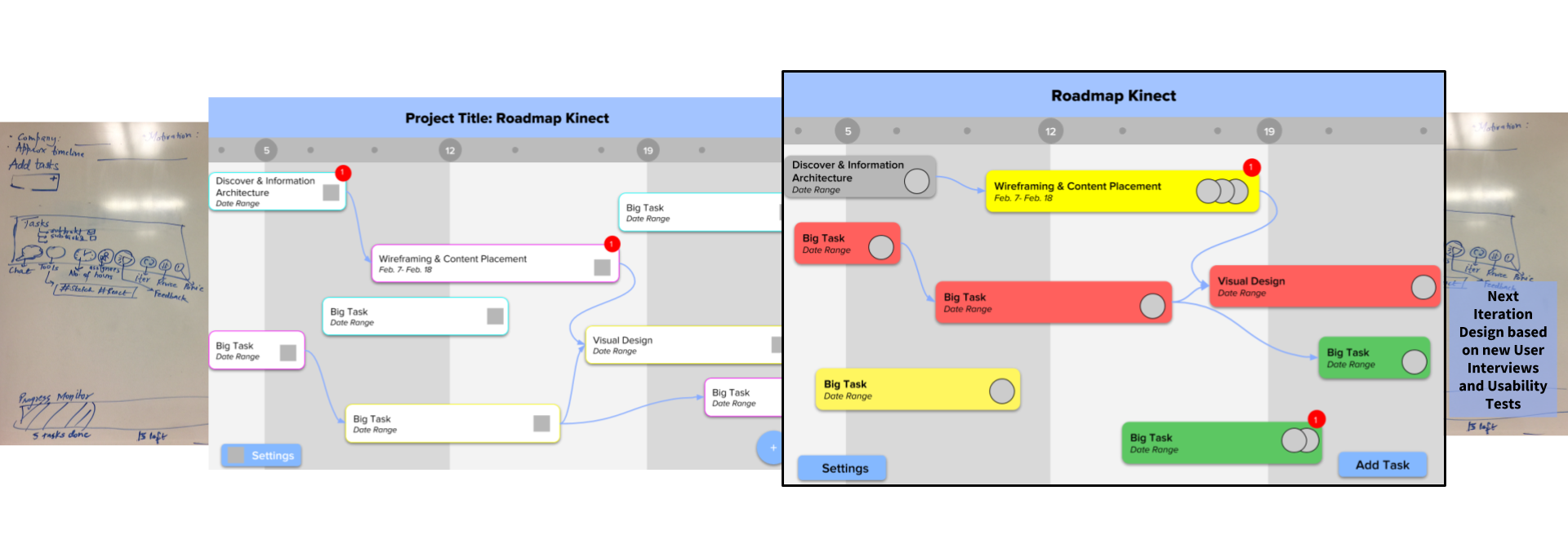
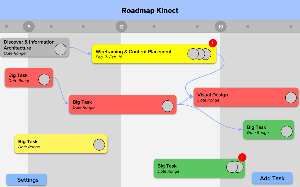
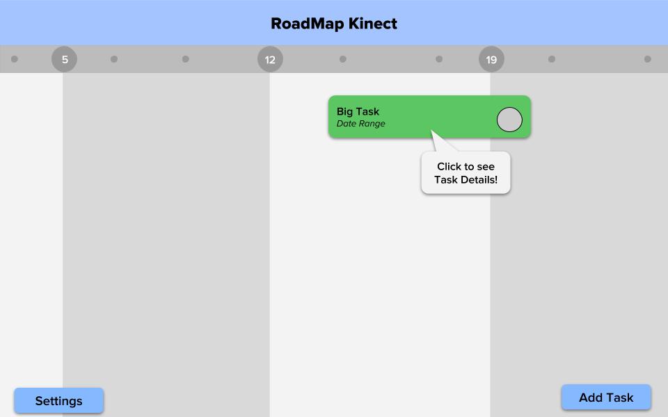
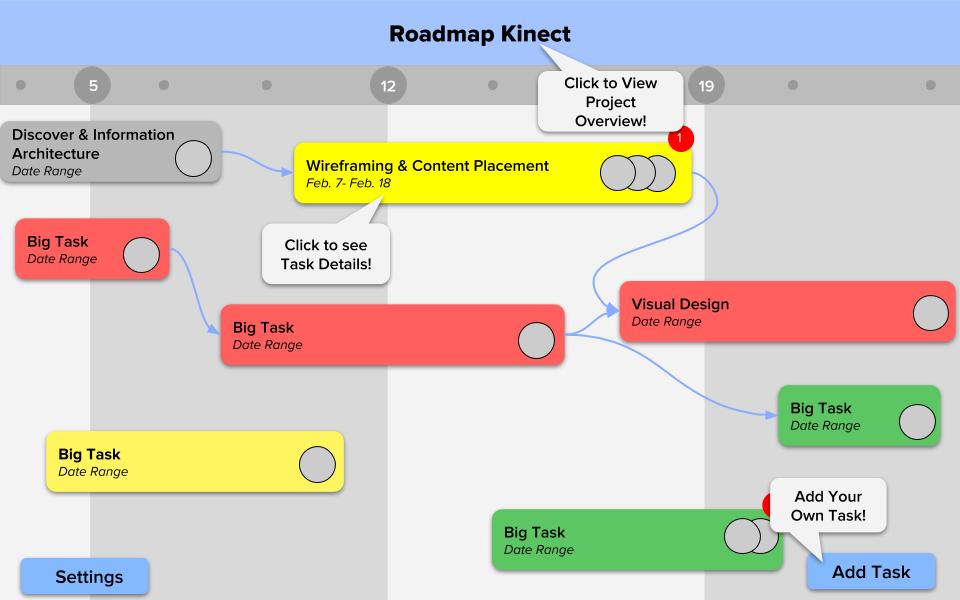
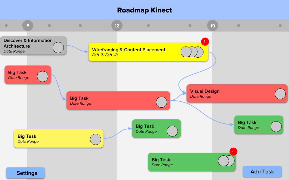
Home View: Our team started with a low-fidelity prototype on the whiteboard of the basic home view screen, outlining a heirarchy of tasks and a progress bar as key concepts necessary in our product. I, then, moved forward to make a mid-fidelity prototype. Here, I used color to show different categories of tasks. I also used a timeline or calendar view to show progress, rather than a progress bar, for more clarity. On the first iteration, tasks are accompanied by icons representing the task (represented by grey squares on the tasks).
In my final design, task types are no longer color coded because there were too many colors/types to remember, and the task name should be clear enough to communicate task type on home view (task type is explicit on index card view). Tasks are now color coded with status: grey means all subtasks completed, green mean subtask dates have not yet arrived, yellow means subtasks are in progress and being completed as per schedule, and red means subtasks are not yet finished but the due date has passed. Tasks are vertically organized as per priority, defined by number of arrows in/out of the task (to break tie, connected tasks should be placed closer together in order to avoid overlapping/confusing arrows). This encourages workflow and teamwork/communication between dependent tasks. Tasks include profile pictures of task/team leader, in order to show people to contact/ease communication for specific tasks; it also helps distinguish types of tasks. “Settings” and “Add Task” are explicit rather than icons, in order to avoid confusion and create the most simple, clear interaction possible. Notifications can be set to visible only for certain teams or roles (“teams” and “roles” set/defined later). To reiterate, the time is set to weeks on this example but can be months/quarters, depending on how the project is created (shown later). Light-grey/dark-grey pattern helps distinguish between weeks, months, or quarters.
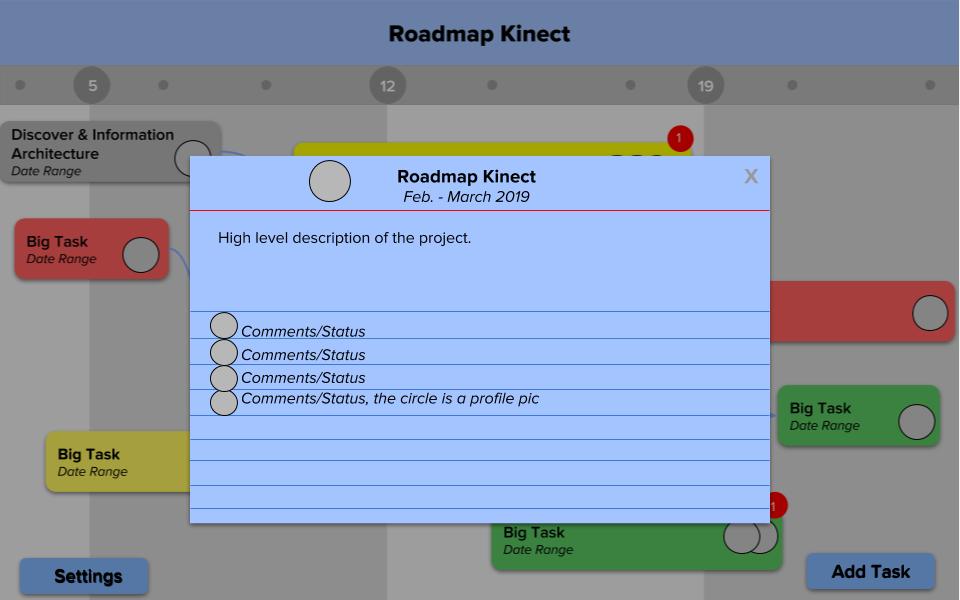
Project Details View: This view was added in the second iteration designs. It opens when the project title is clicked (“Roadmap Kinect”), and shows date range as well as project description. Here, people can post general comments like slack #general/@channel, as well as status updates. This index card is to provide short-term oncomers, like volunteers, an overview of everything currently happening. The comments will get long, but may be necessary for record keeping; therefore, the comments should be in “Recent→Old”/LIFO order, and scrollable while the description and title stay pinned. This index card is blue to show that this index card is different from the others: it is not a subtask, but instead the overarching project description/channel. For now, users may include links to third party tools (Slack, Google Hangouts, Google Calendars, etc.) in the description section to be pinned with the project, until icons/tabs are implemented (refer to “Next Steps” section of this document).
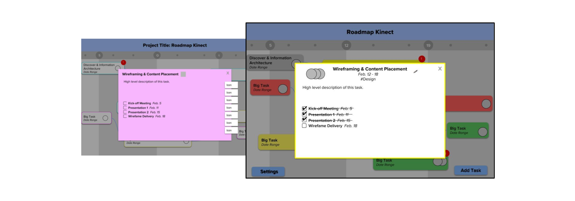
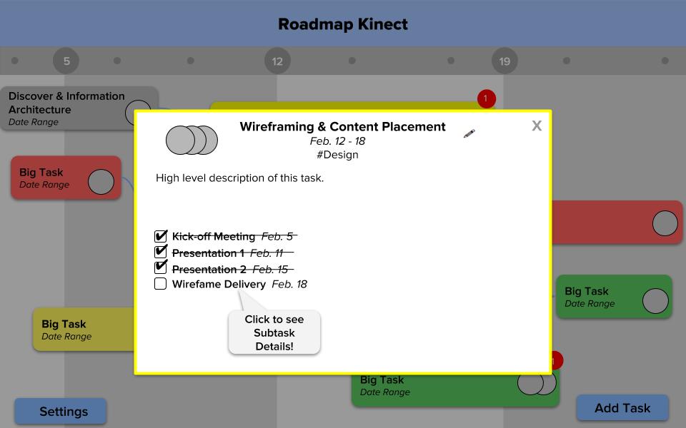
Task View: Index card shows name of task, dates, task type, and profile pictures of leads involved. Also includes description of task, and check-off list of subtasks. Once a subtask is clicked, it “flips” the index card over for subtask info. For now, users may include links to third party tools (Slack, Google Hangouts, Google Calendars, etc.) in the description section to be pinned with the task, until icons/tabs are implemented (refer to “Next Steps” section of this document).
We started off trying to include several third-party tools associated with each task, as represented by the "icon" tabs on the side of the card. However, after doing some user research and analyzing user needs, we found that this took away from the overall theme of simplicity of the design. Therefore, we removed these icons in the second iteration.
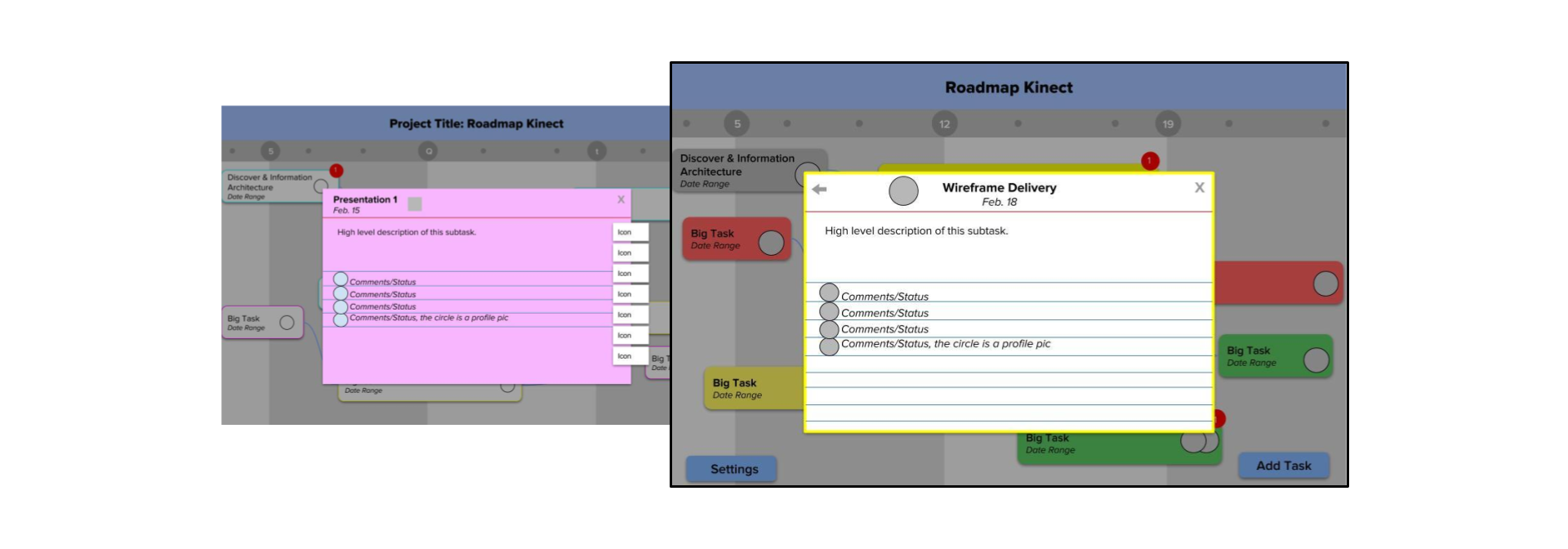
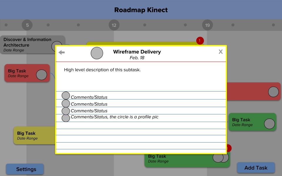
Subtask View: Includes name of task, profile picture of person in charge of task, description of task, date, and comments/statuses (“added as subtask to task Wireframes…” “marked as complete”). The comments may get long, but may be necessary for record keeping; therefore, the comments should be in “Recent→Old”/LIFO order, and scrollable while the description and title stay pinned. Added “Back” button to return to Task index card view. For now, users may include links to third party tools (Slack, Google Hangouts, Google Calendars, etc.) in the description section to be pinned with the subtask, until icons/tabs are implemented (refer to “Next Steps” section of this document).
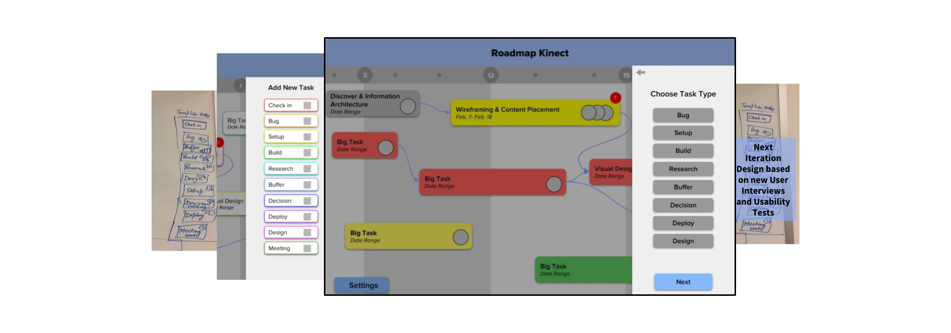
Add Task View: In our first iteration, we created a menu to add tasks to the project. We kept this concept throughout the different designs. However, we refined the task types over the design evolution based on user needs derived from the user interviews.
For the second iteration designs, I created a more specific screen-flow for users to go through the entire process of adding tasks to the home view screen:
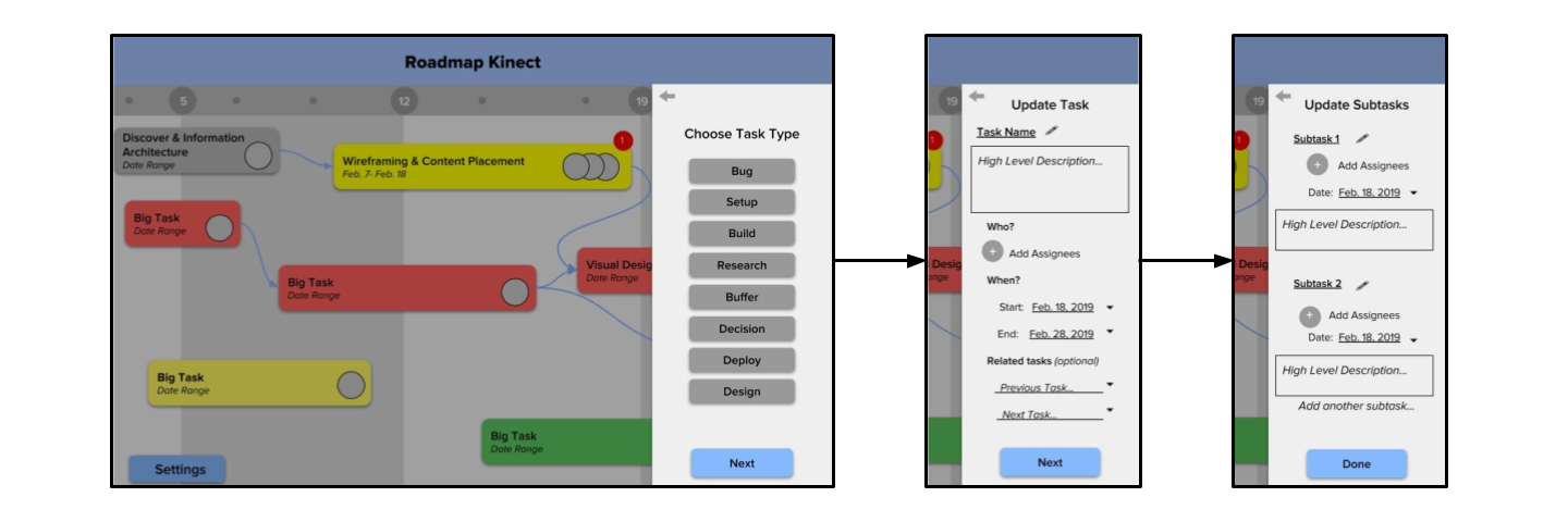
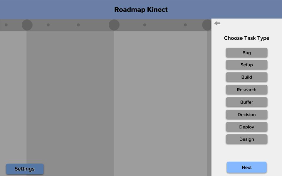
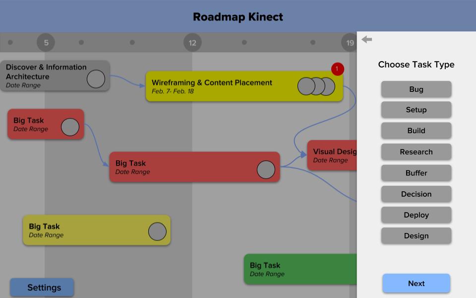
Choose Task Type Menu: This menu is reached when “Add Task” is pressed, and also when the pencil/edit icon next to Task title on index card. The list of task categories is long, and should be changed based on future user interviews. “Back” button goes back to Home view.
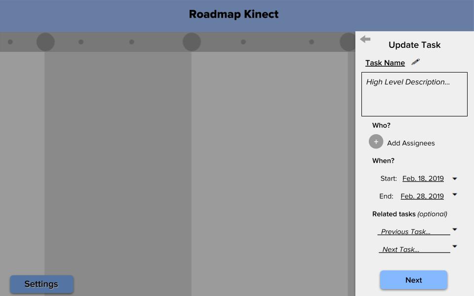
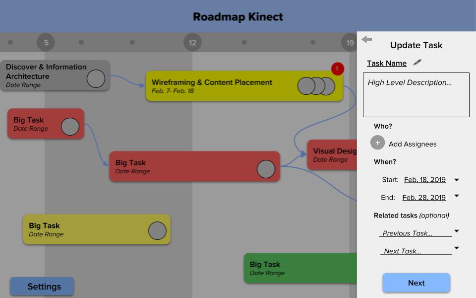
Update Task Menu: Fill in task name, description, assignees, dates, and related tasks. “Back” button goes back to previous Choose Task Type menu.
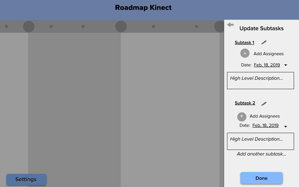
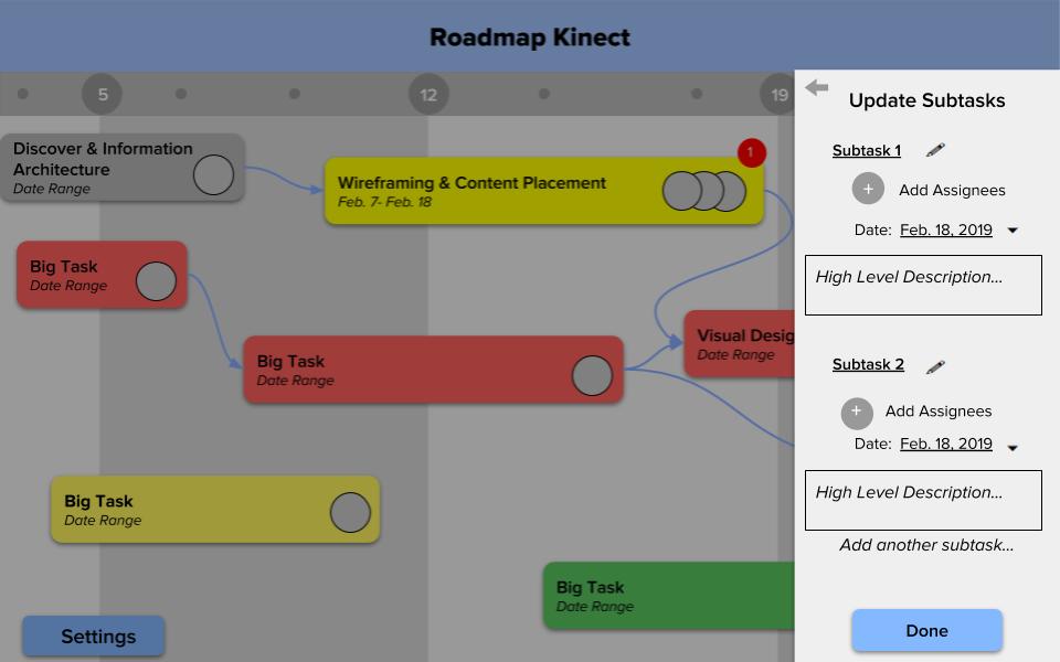
Update Subtask Menu: Fill in subtask names, descriptions, assignees, and dates. “Back” button goes back to previous Edit Task menu.
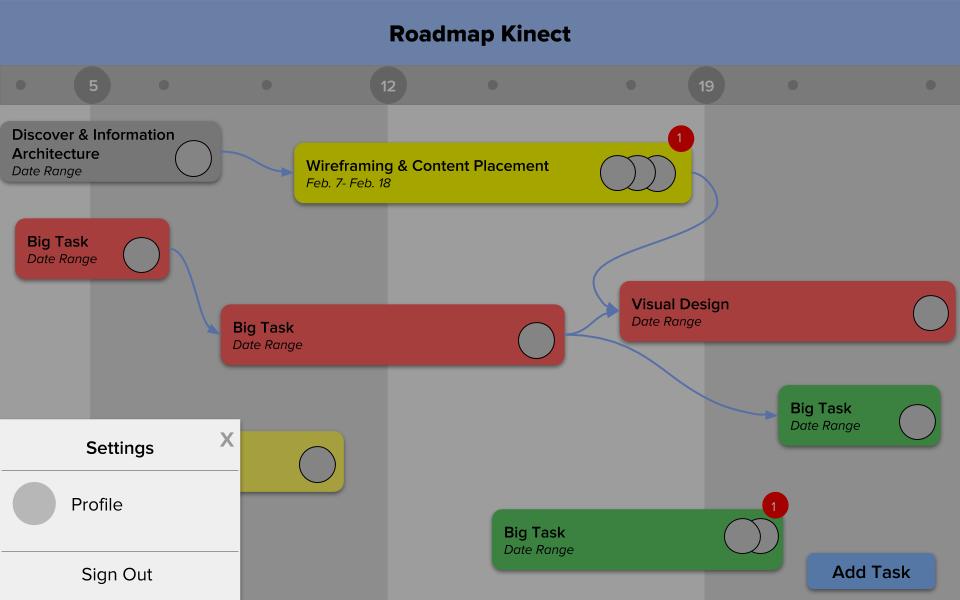
Settings Menu: Finally, in the second iteration, I included a very simple Settings menu. It is used to edit Profile (shown later) and Sign Out. Can be edited later, based on user interviews. In the future, can be used to implement notifications and permissions for different teams/roles. For now, Settings is as simple as possible.
User Journeys
Next, I outlined user journeys for two scenarios: creating a new project (ideal for executives/leaders), or joining an existing project (for later team leaders, project members, staff or volunteers).
Below is the process for creating a new project. This would probably be used by the project executive.
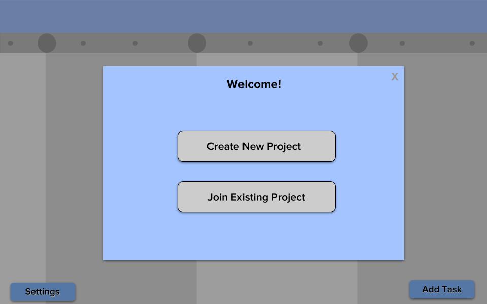
User can select to join existing project, or make new project.
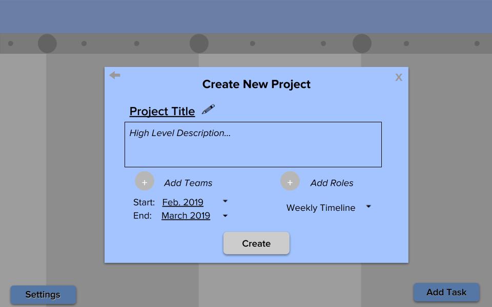
User adds project name, description, possible teams (Design, Research, Engineering, etc.), possible roles (Executive, Manager, Team Leader, Team Staff, Team Volunteer), date ranges, and how to display the timeline (using weeks, months, quarters, etc.). All of the options in the drop-down menu should be edited based on user research/interviews.
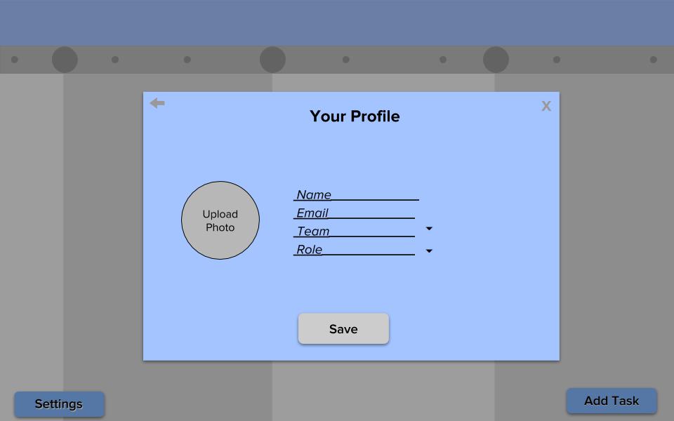
User creates a profile for themself, by adding name, email, which team they belong to, and their role. They also upload a profile picture. This can be edited later by user from Settings menu.
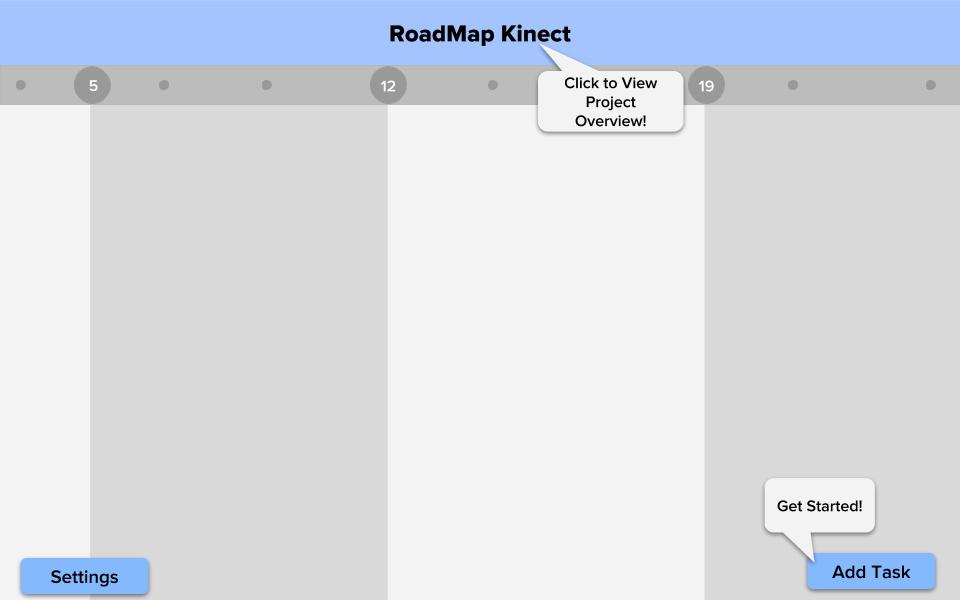
User sees clean board, and “Get Started!” cue helps them add new task. “Click to View Project Overview!” (shown in next user journey) opens #general index card, which creator just wrote during project creation. This cue is more introducing the concept of clicking the title, rather than for reading/understanding project description. Therefore, the creator would want to “Get Started” by creating a Task. The menus below are the same as the previous “Choose Task Type”, “Edit Task”, and “Edit Subtasks” menu.
Introduces concept of clicking tasks to see details (creator is already familiar with task content they just created). “Click to see Subtask Details” cue should also be implemented (shown below).
Below is the process for joining an existing project. This would probably be used by the rest of the project members, including project members, team leaders, staff, and volunteers.
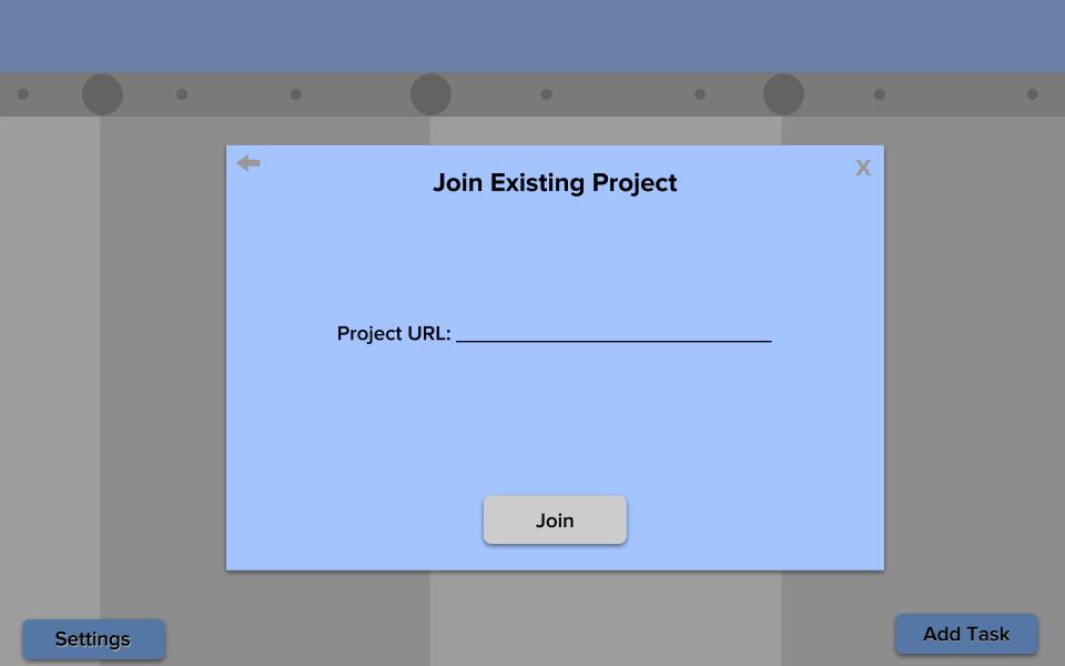
Joining a project with URL is similar to Slack, Asana, and other platforms.
User creates a profile by selecting pre-defined teams and roles by project creator.
If "Click to View Project Overview!" is clicked:
If "Click to see Task Details!" is clicked:
...and "Click to see Subtask Details!" is clicked:
If "Add Your Own Task!" is clicked:
We may want to have an animation to introduce new task has been added to board (green “Big Task” connected to yellow “Big Task” in the lower-half, center was just added by new user).
There are more cues here to help volunteers understand existing project descriptions and tasks, before making their own. The Add Task cue is worded differently to encourage the user to look through board first, before adding their own Task. While project creators may want to “Get Started” by adding a task (since they know/wrote the project description already), volunteers may want to look through the project/tasks first before adding their own. Settings menu should be intuitive enough to not need a cue.
Next Steps
Given time constraints, there were some features discussed that are not implemented in this design. These features depend on more user research and interviews. Some of these include “actions”, implemented as icon tabs on the index cards in the first iteration. These were recommended to be removed until user interviews are conducted to see not only if they are necessary, but also if they should be implemented within the product or connect to other products, like slack, Google Calendar, Google Hangouts, etc.
Another feature to consider is Notifications (of task/subtask updates), which are included briefly in the current design as red circles with the number 1 in it. These currently use Apple’s Notification symbol. However, this requires further user interviews/research to see if it is useful. So far, it was recommended to keep this notification symbol for executives and managers, who regularly check the project and will not be overwhelmed with notifications as a infrequent/new visitor (like a volunteer).
Another feature discussed is permissions, to answer questions like “who can add a new task?”, “who can mark a subtask as complete?”, etc. This feature was discussed to be implemented later, after user interviews/research.
Settings can include different languages for NGOs operating in different countries.
We may want to consider an easier way to add people to tasks/subtasks after the task/subtask has been created; this would make it easier to add short-term volunteers to the task/subtask. This feature can be implemented by right-clicking the profile pictures next to the task/subtask title. This may be confusing, however, because the current design supports profile pictures of team/task leaders or managers, and may add too many profile pictures and cause confusion to the task. This would have to be discussed/decided after user interviews/research. For now, the design stays consistent in adding assigness from the Update Subtask menu, navigating through the edit/pencil icon, and clicking “Next” (the same process as editing basics of Task/Subtasks). Same applies to adding subtasks to tasks.
In addition, some reconsideration can be done about the font, specifically the Project Title. I chose this font to create a welcoming, simple, enjoyable (almost playful) vibe to the platform. However, the title and/or tasks may seem more appropriate in a different, more professional font. An alternative with a similar “welcoming” feel is Source Sans Pro (this font!), Arial, or simply semi-bold (instead of bold) for the title.
The overall color scheme of the platform, disincluding the task status colors, include pastel blue and greys, which complement the “welcoming” vibe, and provide a calm or soothing feel. The color scheme can also be changed in the future, if necessary. A company logo may be added in the top, left corner of the platform/home screen. For now, the design simply offers an overview of utilities, interactions, and user journeys.
Conclusion
Thank you Team RoadMap for the opportunity to explore my interest and passion for design! I really enjoyed this opportunity and learned a lot about user journeys and design techniques.